• If you are still using CentOS 7.9, it's time to convert to Alma 8 with the free centos2alma tool by Plesk or Plesk Migrator. Please let us know your experiences or concerns in this thread:
    CentOS2Alma discussion

Mobile layout: Floated image affecting subsequent module - Bug?

dave-ha

Regular Pleskian
Situation:
- Parallels Presence Builder 11.5.12
- Mobile layout, iPhone
- Website with a two column layout
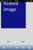
- Text&Image module in the main column, contains a left floated image
- Just underneath of it: Gallery module with some images

Problem:
On an iPhone, the images of the gallery are virtually positioned on the right hand side of the Text&Image module. The gallery is not visible on the iPhone in portrait orientation and the layout can't be pinched. When flipping the device to landscape orientation the gallery is not visible at first either but only appears after pinching the site. The issue could be the floated image in the preceding Text&Image module which affects the subsequent gallery module.

Illustration:
View attachment 8097

Suggestion:
Clear the float or use another CSS technique such as "display: inline-block;".

@ Parallels: Could you please check it? A live sample can be provided if required.
 

Attachments

  • illustration.png
    illustration.png
    11.9 KB · Views: 18
Last edited:
Hi Dave.

Unfortunately I can't reproduce this issue on my own website even while your custom extras/css file is included.
I would appreciate any help to reproduce.

Meanwhile I suppose that this issue it's a side-effect of one of your custom css.
 
Last edited:
Hi Egor,

Thanks very much for checking.

I removed the custom CSS code, published the site, emptied the cache on the iPhone 5 and reloaded the page: Now the thumbnails don't appear anymore, not even in landscape orientation.

After replacing the image in the preceding Text&Images module by some random text and republishing the site the thumbnails appear normally.

There are more pages in the same chapter with the same layout and containing an image gallery as well. However, the behaviour varies by page:
- thumbnails not visible
- thumbnails visible in landscape orientation only
- thumbnails visible

The code on the page where the thumbnails are visible differs from all the others by its structure. This is how it looks like:

Code:
<div class="widget widget-text" id="widget-(...id...)">
			<div class="widget-content"><p><img id="mce-8532" style="margin-right: 20px; float: left;" title="K&uuml;che" src="../../attachments/Image/02_1.JPG?template=generic" alt="ABC" width="453" height="300" /></p></div>

While this is how the others looks like:

Code:
<div class="widget widget-text" id="widget-(...id...)">
			<div class="widget-content"><p><span class="image-block  caption-not-show" style="float: left; margin-right: 20px; width:240px;"><img id="mce-22927" src="../../attachments/Image/01.jpg?template=generic" alt="DEF" width="240" height="279"></img></span></p></div>

Could it be that the CSS code behind the <span> tag causes the issue on the mobile device?
 
Dave, I think this behavior depends from image width which placed above image gallery.

At my test site the image wrapped into "span" tag, but anyway I've also checked your variant without this span and I still can't reproduce the issue.

Could you try to reproduce issue at some another clean site? This will be very helpful.
 
Hello Egor,

Thanks for your reply. I was able to reproduce the issue on a clean site. The URL will follow by PM.

You will find two pages:
  • On page #1 the floated image is in portrait orientation (orginal size: 300 x 349 pixel, resized to 240x279 pixel). This is where the issue with the thumbnails occurs. They quickly appear behind the floated image until it is fully loaded.
  • On page #2 the floated image is larger and in landscape orientation (original 600 x 397, resized to 453 x 300) and the thumbnails appear normally.

I am looking forward to your findings.
 
Thank you, Dave!

I've reproduced this issue and going to fill bug report in the near time. As workaround you can use now such css style (you can place it at "Edit metadata" section):
Code:
<style type="text/css">
.mobile .widget-text:after {
	content: ".";
	display: block;
	height: 0;
	clear: both;
	visibility: hidden;
}
</style>
 
Last edited:
Hello Dave,

Thank you for such detailed report on this problem. We have investigated and fixed this bug in the WPB 12.0.3 that is going to be released in several months. Below you may find the screenshot of mobile version of your site made on the latest development build.

View attachment 8153
 

Attachments

  • WPB 12.0.3 screenshot.png
    WPB 12.0.3 screenshot.png
    20.9 KB · Views: 4
Last edited:
Back
Top