• We value your experience with Plesk during 2024
    Plesk strives to perform even better in 2025. To help us improve further, please answer a few questions about your experience with Plesk Obsidian 2024.
    Please take this short survey:

    https://pt-research.typeform.com/to/AmZvSXkx
  • The Horde webmail has been deprecated. Its complete removal is scheduled for April 2025. For details and recommended actions, see the Feature and Deprecation Plan.
  • We’re working on enhancing the Monitoring feature in Plesk, and we could really use your expertise! If you’re open to sharing your experiences with server and website monitoring or providing feedback, we’d love to have a one-hour online meeting with you.

Question So where is Customize Subscription now??

seqoi

Regular Pleskian
I am really frustrated by all the new "changes" they are "inventions".

Latest Obsidian update. How the hell do I customize a specific Subscription expiration date?

They keep changing appearances and tabs in each update. Official docs most definitely don't apply (I just went thru them). It used to be just fine - I was able to change specific customer expiration dates just fine.

This morning I spent 35 minutes trying to find "Customize" which is not there anymore.

But hey I must be happy because there are other genius icons which when I click on them ask me "Will I be upset if they move columns I used to use"...

I am not against changes but sometimes you don't need to fix something which worked fine. If you do, at least you could update your official documentation.

Please how do I change specific subscription expiration date for a customer? Toute me like I am an amateur because I've spent 35 minutes and couldn't find it anymore.

Thank you.
 
After spending more time I have found it. It was behind yet another "we are going to hide it for you" icon where they ask me if I am going to be upset.


Most definitely I am taking that survey.


Not cool
 
I find it for 20 seconds: expir.mp4
Yeah you must be amazing. Seriously have you read my initial post at all ? :rolleyes:

In my panel since this morning it was hidden completely. Whole column was missing. In your video it's where it always was (where I expected it).
It revealed itself only after I clicked one tiny icon. And then message popped out (will you be upset if we move this column).

thanks for your insight.
 
Thank you, I realized that this column was hidden by default.
Alternatively, you can override this behaviour using the following option in the panel.ini:
Code:
[navigation]
collapseSecondarySidebar = false
 
Hopefully more people will do the poll on this. We, too, are having this issue with the missing syncing and customizing link for subscriptions. With the change of the GUI the number of clicks to achieve everyday tasks is steadily increasing :-(
 
Hopefully more people will do the poll on this. We, too, are having this issue with the missing syncing and customizing link for subscriptions. With the change of the GUI the number of clicks to achieve everyday tasks is steadily increasing :-(

Absolutely agree! I prefer having a good overview and achieving things with the least possible amount of clicks whenever possible. I really hope the sidebar will remain....
 
Like I said I am not against the changes if they are for the better, but I simply don't understand this.

They literally are ruining and changing workflow when no one ever asked them to do so.

Can anyone show me since when was the last time anyone ever complained about these columns like ever??
 
What IgorG proposed is a fine solution however this begs the question (and it's terribly unfair):

How do I know what to enter in panel.ini to make my troubles go away and why would I want to do it in the first place? As if they feel it's normal that customers experience problems when they decide to hide things, customer waste time on seeking solutions on forum places while at the same time their documentation isn't updated accordingly.

It's a really unfair and messy environment. Not cool at all. We decided to run Plesk for the simplicity and speedy workload. This started to change.

Plesk is slowly becoming like Xiaomi or Huawei of Android phones - where I don't have anything against these companies. They produce fantastic hardware but I or my company just doesn't want to be a public beta tester for their software shifts, and immature trends which change two times a year.

I simply don't want features no one asked about, I don't need new algorithms to do things for me and I for sure don't want to be a hostage to some silly product manager which doesn't know where or how to go with the future.

I want Plesk to be what Plesk was since always. Stable solution.

Is it so hard to think and understand old simple wisdom: If it ain't broken don't fix it.

But hey...I am cool genius so let me rape current customer base and force silly things upon them.

If this trend continues then I am affraid Plesk is becoming very risky platform - definitely not what it used to be.
 
Thank you, I realized that this column was hidden by default.
Alternatively, you can override this behaviour using the following option in the panel.ini:
Code:
[navigation]
collapseSecondarySidebar = false
Would be nice if that was listed as an option in the panel.ini viewer - because it's not !
 
No need to edit panel.ini
  1. Login to plesk
  2. Go to Subscription List
  3. Click on subscription which you wish to customise
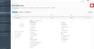
  4. On right side in front of subscription domain name, theres small triangle icon. click the icon, it shows right sidebar
Mediastroke Windows hosting tips
 
Yeah well that was around 7 months ago. There were some changes in the meantime plus old users were not so keen on this. I can see this not being an issue for someone just starting. But anyway thanks for the screenshot - it will be helpful for someone else looking into similar subjects.
 
Back
Top