• Please be aware: Kaspersky Anti-Virus has been deprecated
    With the upgrade to Plesk Obsidian 18.0.64, "Kaspersky Anti-Virus for Servers" will be automatically removed from the servers it is installed on. We recommend that you migrate to Sophos Anti-Virus for Servers.
  • The Horde webmail has been deprecated. Its complete removal is scheduled for April 2025. For details and recommended actions, see the Feature and Deprecation Plan.
  • We’re working on enhancing the Monitoring feature in Plesk, and we could really use your expertise! If you’re open to sharing your experiences with server and website monitoring or providing feedback, we’d love to have a one-hour online meeting with you.

Question How to click from "classic list" into "active view" instead of "dynamic view"?

Bitpalast

Plesk addicted!
Plesk Guru
Since 18.0.38 a major usability change was introduced that is disturbing the workflow:

Previously when in "classic view" (the list of all domains of an account) and clicking on a domain, one got into the "active view" presentation of the detailed settings. From there a customer could directly click on an icon to enter a specific configuration page. Now, when doing the same, Plesk displays the "dynamic view" page of a domain. The customer now needs to first find the right tab to then find the right setting. Plus the icons look different and the order of entries is different. Plus some extremely important icons like our "FAQ" link is now only visible on that page after a customer has clicked the "User defined services" tab.

This is an enormous deterioration in usability for all customers. But that's not all. In addition we'll also have to update all of our FAQ articles that previously described ways to set configuration like "... click on the ... icon", because there now is an additional step to click on a tab first, e.g. when a customer wants to update email settings.

We'd prefer to keep things as they are as customers are used to one view. It's o.k. to give them an option, but it's absolutely not o.k. that they are confronted with a new view if they did not choose this new view themselves.

Is there a panel.ini setting to tell Plesk to use the "active view" configuration page when a customer enters a domain from the "classic view" list? We already have an entry in panel.ini
Code:
[navigation]
forceWebsiteList = active
but this only sets the "active" view as initial view. If someone is using "classic view" the links from there to a domain do not go to "active view", but to "dynamic view".
 
+1: give us the old view back, or at least a choice to change it back our self.

In domain view it takes now 3 clicks to get to the list of email addresses, that is 2 in the Active List View, 50% more so NOT an improvement.
People don't change there website every 2 weeks. The most used feature in Plesk is changing, adding, deleting email addresses due to a new employee, vacation, someone leaving the company, etc...

regards
Jan
 
Hello, thank you for your feedback.

To be honest, we would like to get rid of old domain views in Plesk (Classic, Active) and keep the Dynamic List only (very soon). We enabled the Dynamic List by default for new Obsidian installations since October 2019 (almost two years ago). We are not investing in the old views for a very long time while we continuously bring improvements in the Dynamic view. And changing the view under the Domains list is just a first step.

And we would like to make the Dynamic List better than any of the old lists. So, I will jump to the reported issues:
1." In domain view it takes now 3 clicks to get to the list of email addresses, that is 2 in the Active List View, 50% more so NOT an improvement."

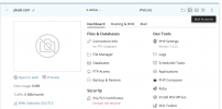
I agree, and I confirm this issue as Critical - we will fix it. Btw, in the original Dynamic List (not used under Domains tab), the mail accounts are available in one click, see my screenshot:
Screenshot 2021-09-15 at 19.44.18.png

2. "some extremely important icons like our "FAQ" link is now only visible on that page after a customer has clicked the "User defined services" tab"

I also confirm this issue as Critical - we'll make improvements to have custom buttons available right on the main dashboard in the Dynamic List.

3. New view and order of the buttons.
The customer now needs to first find the right tab to then find the right setting. Plus the icons look different and the order of entries is different.

we'll also have to update all of our FAQ articles that previously described ways to set configuration like "... click on the ... icon"

One of the reasons why we decided to invest in the development of the new domain list there were numerous reports that the presence of all the buttons on the screen is more like a dump in which is difficult to understand. And we are trying to organize it in the best way based on interviews and UX researches with existing users and people who see Plesk for the first time.

I fully understand that habits are an important part of our life, and any changes in this matter could creating additional issues for you as a service provider (need to learn new views, need to update docs, etc.). But in this case, it is not clear for us how to make our product better and simpler, moving forward with new trends and fit to needs of others and new customers without making major evolutionary changes.

This is an enormous deterioration in usability for all customers.
Thank you again for the provided information, it's very important for us.

If you have any additional feedback on which is important buttons/features are hidden under tabs now while they should be available in one click - please let me know, we will review and make changes.

Also, we have mockups of our vision of what we would like to see in the Dynamic List at the end. If you are interested to see them and provide your feedback or agree to a short interview regarding this topic - please ping me in DM, I would be happy to get more feedback from you.
 
Thank you for the detailed explanation. I really appreciate this.

I think evolution is o.k., but recently we have seen many evolutionary steps that require more clicks instead of less. Anything that requires more clicks = bad. Anything that requires less clicks = good. If we need to switch to the dynamic style, o.k., but in that case please if possible check the new user interface by this aspect "number of clicks" to achieve a task.

Example:
When I now create an add-on domain to an existing subscription, the final step beams me onto the dynamic view page of that newly created domain. In order to add a second add-on domain I now have to first click back to either the subscription main page or to the "Domain" link (in the breadcrumb), because the "Add domain" button is only available there, but not on the dynamic view page of the newly created domain. Compared to the "active" view this is an additional step.

So if you could manage to create the new view with either a reduction of clicks for common tasks or at least a status quo, probably users like me will be o.k. with that. The current situation however with the drawers and the dynamic view is that for adding a customer, a subscription or a domain several additional steps became necessary.
 
To be honest, we would like to get rid of old domain views in Plesk (Classic, Active) and keep the Dynamic List only (very soon)

Shouldn't a company offer its clients what the clients want, not what "they" want?
Yes, talking to clients can give you insight, but even if you interview ten thousand people that is still only a small percentage of all the plesk users.

Every product has 3 types of users:

Those that hate it and speak up (maybe 1%)
Those that love it and speak up (maybe 1%)
All the rest (98%) that do one of the 2, but don't speak up. I know that the hardest thing for a company is to find what those 98% think and want. Listening to the other 2% is a good place to start. Most of the people that bother to answer here are company owners that have first hand experience with the "not so savvy" plesk end user.

If the view is here to stay, give us at least a few icons again instead of all black text links on a white page (back to the 80's ?)

also give us the option to remove the preview window.
- Not yet registered domainnames give time out
- Moved websites will lead it in from another server
- Hacked websites my compromise the users pc. Can you 100% guarantee that a hack will be filtered out when loading the website preview? I am 1000% against loading websites in frames.

how to make our product better and simpler, moving forward with new trends and fit to needs of others and new customers without making major evolutionary changes

Moving forward and making a hosting panel better is adding more feature. spam filter to mailboxes, secure ftp, etc... But creating a mailbox (give username, give password, click OK), is still the same as in plesk 1.3. Even IMAP v4 (rev1) was released in 1996.

Change just for the change is only providing work for programmers. change has to serve a purpose. Not all change is change for the better and companies should have the courage to turn back a bad change (remember the coca cola taste change in 1985 ?).

New customers don't have an idea of what it could, should or would look like. All they "know" is screenshots they saw on the internet and (in part) based on those screenshots they have decided they should switch from there current control panel to plesk. How do you think they feel when plesk suddenly looks a lot different then what they saw in the screenshots?

just my 2 cents
Regards
Jan
 
@Peter Debik
Example:
When I now create an add-on domain to an existing subscription, the final step beams me onto the dynamic view page of that newly created domain. In order to add a second add-on domain I now have to first click back to either the subscription main page or to the "Domain" link (in the breadcrumb), because the "Add domain" button is only available there, but not on the dynamic view page of the newly created domain. Compared to the "active" view this is an additional step.
This change is not related to the Dynamic List. This is a recent change in the 18.0.38:
  • Plesk now redirects the customer to the created domain’s card after website creation.
It's intended to fix issues related to the changing options of a "wrong" domain which happened when you see a few domains in the list (how it was reported by customers).
The main reason for changing the default is that usually customers continue to configure the domain after the creation instead of adding new addon/subdomains. Based on stats, the majority of Plesk customers have one domain per subscription.

For your case, you can disable this behavior using the following panel.ini options:
[domainManagement]
openDomainOverview = false
 
@Linulex
also give us the option to remove the preview window.
- Not yet registered domainnames give time out
- Moved websites will lead it in from another server
- Hacked websites my compromise the users pc. Can you 100% guarantee that a hack will be filtered out when loading the website preview? I am 1000% against loading websites in frames.
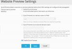
You can disable website preview at Tools&Settings -> Website Preview.
preview.png
Moving forward and making a hosting panel better is adding more feature. spam filter to mailboxes, secure ftp, etc... But creating a mailbox (give username, give password, click OK), is still the same as in plesk 1.3. Even IMAP v4 (rev1) was released in 1996.
Could you provide a shortlist of top features that you expected to be implemented/still missed in the Plesk Panel? It will be useful.

We are continuously investing in different areas of Plesk including mail improvements. These improvements are based on user's demands.
 
@Anthony

You can disable website preview at Tools&Settings -> Website Preview.

This is not what i meant. That preview is good and my customers need it. We even registered the special domain mijnpreview.com for it.

I meant the little preview window at the dynamic list view page.

Could you provide a shortlist of top features that you expected to be implemented/still missed in the Plesk Panel? It will be useful.

One thing that can be vastly improved is the Cron jobs page. I have 25+ years experience with linux (started with slackware and then suse, redhat, centos and now alma). But i can't write down a cron line from the top of my head. I can image what the average plesk user must think when presented with a line to add some stars, number etc...

These are my thoughts on cron jobs:
- to enter them: have a look at the way webmin does is. Even a linux novice can enter a cron job there.
- cron type restrictions: There are 3 types of crons possible, make it that the admin can restrict the types. for example: only fetch url and only from the own website.
- cron time restrictions: times crons are allowed: for example: no crons between 00:00 en 06:00 hours due to backups and statistics
- cron frequentie restrictions: minimun time between cron jobs: for example: only allowed every 15 minutes or higher. At this time is is very simple to create a cron that runs every minute and takes 3 minutes to complete. We once had a client that ran a cron every minute to create backup of /httpdocs. From that time on we hidden the cron jobs in plesk and now customers must mail us to create a cron job.

A second thing is a virus killer. Why do we have to pay more then the Plesk panel itself costs for something as fundamental as a virus killer? A free open source viruskiller non the less. We install clamav and clamav-milter on every server, add sanesecurity and pay for the securiteinfo.com defenitions, all as a free service for our customers. If clients want to pay for a viruskiller we will install the kaspersky add-on, but i can not and will not ask money for open source.

If there are any questions, just ask, i know i can be a bit vage at time and have problems to express excactly what i mean, but that is because english is not my first language.

Regards
Jan
 
@Anthony

I just noticed this. This is another point that need to be fixed: some warning emails. When a mailbox is over sized the mails says:

The 'xxxxxxxxxx' account is approaching or already exceeded the limits:
Mailbox size: 15 GB Limit / 15894925.7 KB (101%) Used / 0 KB (0%) Remaining


But it does not say what mailbox is over the limit.

Regards
Jan
 
@Linulex

Thank you for your feedback!
also give us the option to remove the preview window.
- Not yet registered domainnames give time out
- Moved websites will lead it in from another server
- Hacked websites my compromise the users pc. Can you 100% guarantee that a hack will be filtered out when loading the website preview? I am 1000% against loading websites in frames.
I can't say will it be fixed or not - the demand is pretty low, I've found just two similar requests. But I agree that the website preview is not working correctly in some cases, and we will check if it can be improved. I've registered your request with number #PPM-4463.

One thing that can be vastly improved is the Cron jobs page. I have 25+ years experience with linux (started with slackware and then suse, redhat, centos and now alma). But i can't write down a cron line from the top of my head. I can image what the average plesk user must think when presented with a line to add some stars, number etc...
Thank you for the detailed explanation. I've registered this feedback as request #PPM-4464. We will review how we can improve Scheduled tasks functionality.

A second thing is a virus killer. Why do we have to pay more then the Plesk panel itself costs for something as fundamental as a virus killer? A free open source viruskiller non the less. We install clamav and clamav-milter on every server, add sanesecurity and pay for the securiteinfo.com defenitions, all as a free service for our customers. If clients want to pay for a viruskiller we will install the kaspersky add-on, but i can not and will not ask money for open source.
The main point here is that Plesk is not a software specialized in security from viruses. The support of ClamAV for us means additional costs to support and maintain this solution. At the same time, our partners from CloudLinux already providing ImunifyAV antivirus in Plesk as an extension. Yes, it's a paid solution but we are reducing our maintenance costs by providing solutions from experts in this area.

I just noticed this. This is another point that need to be fixed: some warning emails. When a mailbox is over sized the mails says:
But it does not say what mailbox is over the limit.
I confirm this report as a software issue with ID #PPP-54466. We will fix it.
 
The main point here is that Plesk is not a software specialized in security from viruses. The support of ClamAV for us means additional costs to support and maintain this solution.


I am sorry to say: but you already do that with the addon "Plesk Email Security"

I have also looked into amavis, but that also controles spamassassin and that is already part of plesk so i choose clamav-milter.

Regards
Jan
 
@Linulex
I just noticed this. This is another point that need to be fixed: some warning emails.
But it does not say what mailbox is over the limit.
I confirm this report as a software issue with ID #PPP-54466. We will fix it.
FYI, we evaluated this fix. Due to our technical implementation of stats and resources calculation to identify an exact mailbox instead of an account will cost us 3-5 days of additional development. Sorry to say but we are not ready to invest development time in this issue until we will receive more requests of similar functionality.
 
@Linulex
I meant the little preview window at the dynamic list view page.
To disable the website preview window:
1. Specify in the panel.ini configuration file:
[screenshotService]
url = ""

2. Restart Plesk services
service sw-engine restart && service sw-cp-server restart
 
FYI, we evaluated this fix. Due to our technical implementation of stats and resources calculation to identify an exact mailbox instead of an account will cost us 3-5 days of additional development. Sorry to say but we are not ready to invest development time in this issue until we will receive more requests of similar functionality.
@Anthony I am sorry to read this feature will not be implemented (any time soon). I realize 3-5 days of development is a lot for such a minor feature. However, even though it's a minor feature I would like to argue that it would be a great improvement for some user. Including myself. Having the notifications clearly mention which mailbox is exceeding the limit would save quite a bit of time spend on supporting customers who are often a bit confused by the notification. They are less inclined to follow up on the notification as it not clear which mailbox(es) has exceed the limit. I also noticed customers disregarding the mailbox limit notifications completely because they think it is some sort of phishing mail.

So I hope you would perhaps want to reconsider on this issue :)
 
Back
Top