• If you are still using CentOS 7.9, it's time to convert to Alma 8 with the free centos2alma tool by Plesk or Plesk Migrator. Please let us know your experiences or concerns in this thread:
    CentOS2Alma discussion

Question web design question

didan

New Pleskian
I'm new to front-end web development. I have a webpage that I'm developing in React.js and it looks great on a browser but absolutely horrible on a mobile phone. What do I have to do in order to make them look somewhat similar (desktop browser vs mobile device browser)?
 
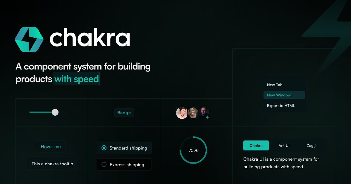
Using a component library will make it much easier to develop for mobile and web.

i.e.:
 
Hello this is Gulshan Negi
Well, you can do this by using a responsive design framework, media queries, flexible units, and testing your web page on different devices—all important steps to achieving a responsive design.
Thanks
 
Using a component library will make it much easier to develop for mobile and web.

i.e.:
accounting company website
Thank you very match
 
There are a few more libraries:
- Radix UI - an open-source unstyled component library.
- shadcn/ui - uses the unstyled components from Radix UI and applies Tailwind CCS to them.
 
Last edited:
Back
Top